The Science of 70% – The Tilley 70/30 Rule
One technique that is integral to the science of Transition Economics’ (TE) Proof Charts (TEPs), is The Science of 70%, 70/30 Principle, or Tilley 70/30 Rule (named for its creator Edward Tilley in his 2018 book “End of War”).
Similar to the Pareto 80/20 Rule and Six Sigma Standard Deviation quality control sciences, The Science of 70% is an easy approach that anyone can use to find causal (important) indicators within very large, economy-sized datasets.
 Transition Economics permits us to determine if any measure is a high-causality (important) indicator by scoring its frequency distribution based on the 70% threshold of other causal indicators.
Causal indicators (like Trade Balance or Social Contract) can advance an economy’s “high-transaction system” just like a high-probability-of-success casino game can ensure that the house always wins.
Countries with causal indicator values (which are) higher than the indicator’s “threshold”, are said to be “Advancing” (per this causal measure), while countries with values that are worse than threshold, are “Collapsing”. And, there are many causal indicators to validate an assertion that your nation is Advancing – or Collapsing. See 90% of large Democracies are collapsing.
By comparing (ranking) the scores taken from TEP Frequency Distribution charts, we can find which measures/indicators are important (causal to advance or collapse in an economy), and which indicators are not influencial (to advance or collapse).

Unlike Standard Deviation, which looks for how closely is data grouped together, TEP Frequency Distribution (FD) charts hope to determine does an indicator’s data foretell Advance AND Collapse across 220 countries. A higher amplitude TEP Chart forecasts advance and collapse, and a lower amplitude TEP (the great majority of FD charts) does not.
Consider these charts:
| Standard Deviation (SD) | Social Contract SD Chart [1] | Social Contract XY Scatter Chart [2] | Social Contract TEP Chart [3] |
 |
 |
 |
 |
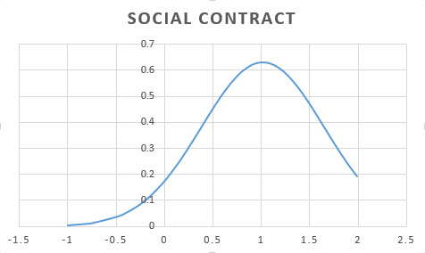
“Social Contract” is an index (aggregate) indicator that combines several measures into one measure – like an S&P 500 Index “stock” or like a GDP Report. Find an explanation of Social Contract at csq1.org/SCP
The Social Contract Index is always a causal measure because indexes are adjusted until optimal causality is found. This “Machine Learning” process is explained on the “TE How it Works” page and at WAOH’s Data Science webpage.
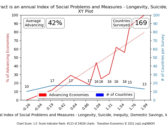
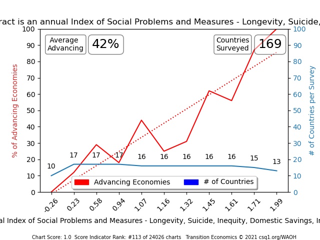
Chart [1], [2], and [3] above, map the same data for Social Contract. We know that Social Contract is an important (causal) measure because Charts 2 and 3 show us that nations with high scores are advancing 100% of the time, while nations with low scores are collapsing 100% – based on surveyed evidence in 169 measured countries.
Notice that the blue lines in TEP charts 2 and 3, also show the number of nations included in each data distribution “frequency”/range calculation for “percent of nations that were advancing (according to their trade deficit or surplus)”. Let’s step through these charts slowly and explain what each line is reporting.
- From left to right on the Red Lines, Charts 2 & 3 compare 10 nations with Social Contract scores that were less than -0.26; 100% of the 10 were “collapsing” which means their values were below threshold
- The second frequency distribution range calculation compared 17 nations that scored greater than (or equal to) -0.26 and +0.23 (TEP XY Chart [2] and TEP Chart [3] both show the same vertical Y-axis values). 12% of nations surveyed in this range were “advancing” and 88% were “collapsing” (again, according to Trade Balances greater or less than 0)
- The third survey compared 17 nations that scored between greater than or equal to (>=) .23 and less than (<) .58; 30% of those nations were advancing and 70% were collapsing.
- And so on … until a “42% Average Advancing” dataset across 169 countries was compared in the TEP’s frequency distribution chart
Note how the “TEP Chart [3]” above ignores the distance between its frequency-distribution surveys (plots them an equal distance apart while capturing the value of the data set at that point), while the XY Scatter Chart’s red line shows the actual linear variance between each frequency distribution survey.
TEP doesn’t ignore X-axis distances – rather it realizes that a linear X-axis measure is less important (as we understand it today) than the measures that it reports clearly; the value at the frequency interval where a significant number of countries can be surveyed. We always want to ensure that no fewer than 7 countries are included in any analysis of a Collapse or Advance point. Fewer than seven countries in a single calculation makes it exponentially less statistically significant, so we try to keep each frequency distribution at 10 and higher where possible.
TEP Charts can have no fewer than 4 datapoints as well, which is why it takes 28 country indicator surveys, at a minimum, to create a TEP Report.
The amplitude of Y-axis values is the important takeaway measure here; specifically, the variance between the maximum survey result and the minimum surveyed value. In the example Chart 3 above, 100 – 0 = 100% – or a score of 1 (one).
If this sounds complicated, it’s not; in fact, it’s a very simple, easily repeated technique. With the help of a computer, it just takes a few steps to mine value from even the largest dataset using this approach. Even our ten-year-old computers chew through this computation work with ease at incredible speeds.
To explain how this works, let’s take a real-world example. You can follow along with a Jupyter Notebook session or use a spreadsheet as well if you like. I assume here that you have a pretty good understanding of spreadsheets, so look for tutorials online if you need spreadsheet help …
Skill Level: Beginner
Glossary:
Fun Fact: Eskimos have 50 words for “snow”; and the same detail is important when working with data
- APIs – allow us to see and pull down most-recent data online whenever we wish. API pages are URLs like “www.google.com” and typically use a format called JSON or XML. Our spreadsheets use data formats like .CSV, .xlsx, .xls, and similar.
See an example API here: https://api.worldbank.org/v2/country/all/indicator/SP.POP.TOTL?format=json - Columns versus Rows – data columns are verticle (run up and down) while Rows are horizontal (run left to right/right to left). Fun Fact: 30% of the earth’s population reads Right to Left
- Data – is any information that we need to build a chart with – including Country name, Indicator name, Indicator Value
- Datapoint – one single value in a set of data values; Microsoft Excel calls this a “cell” while the number or text within in the cell is the value
- Datapoints – a count of the number of cells with values
- Data Quality – Governments lie about embarrassing stats, countries fail to report stats consistently or fully, military spending can be spread across many reports, suicides can be reclassed unknown or COVID or Fentanyl Deaths, on and on. The consistency of lying and challenges of reporting, consolidation, and distributing quality data, is true for almost all counties so context and multi-measure validations are essential. Read how this is accomplished in the Global Leadership Book of Knowledge (GL-BOK) and the WAOH Econometric Library
- Data Set – Think of a Data Set as the Column’s 215 datapoints in the example below
- Data Types – Data can be numeric (floating point decimals, integers, etc.), characters/strings, etc.
- Data Value – the actual value within each datapoint (cell)
- Metadata – is information about the data. Data Type is a metadata, a description of the data, or the source of the data can also be documented in metadata; metadata can include revision histories, etc.
- TEP Score – Score is the amplitude of a TEP chart; the difference between its maximum value and its minimum value
- Threshold Value – is the data value contained within our 70% datapoint. This value becomes the threshold for Advance or Collapse for this indicator. For an explanation of how Threshold Indicators are used to determine causality (importance) of any measure, read Transition Economics
Exercise 1: Determining the 70% value of any indicator
-
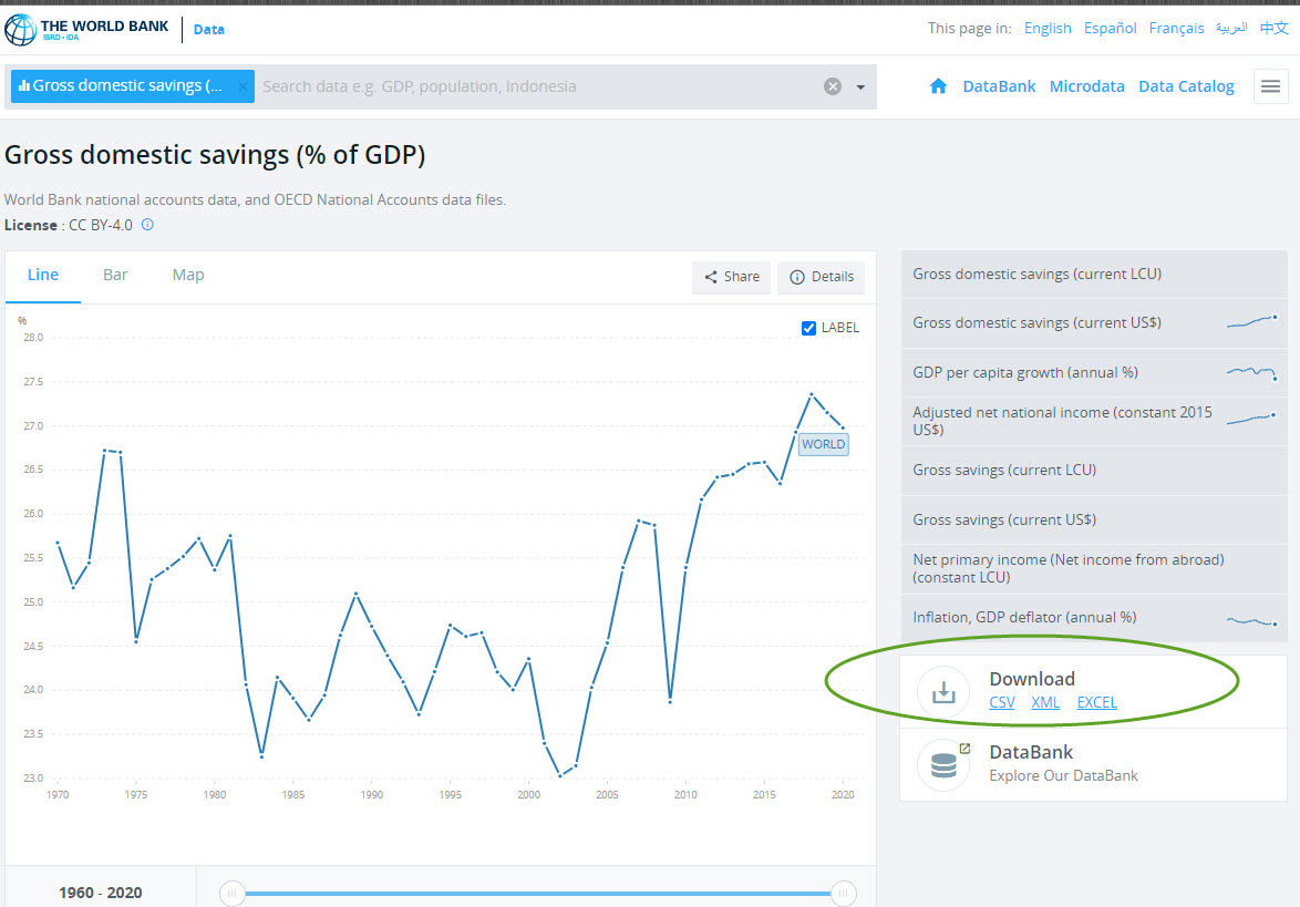
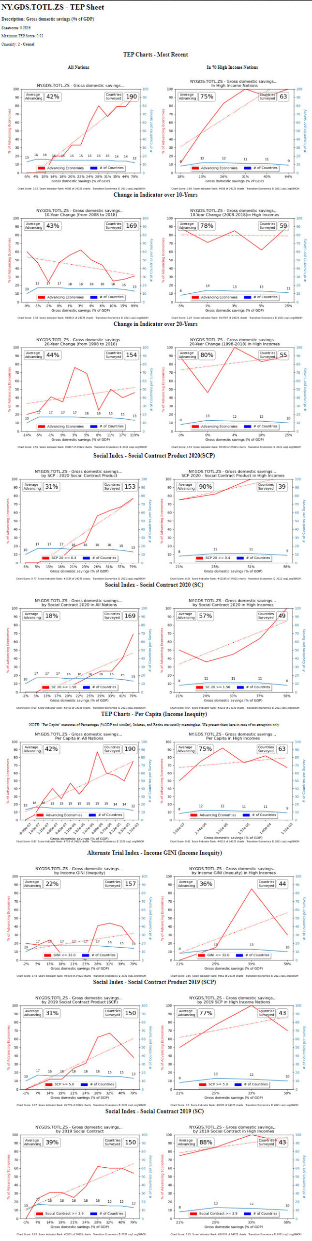
- First, let’s download data for a causal indicator. Click on this hyperlink – https://csq1.org/info/NY.GDS.TOTL.ZS.htm – and you can also find this link to “Gross Domestic Savings (% of GDP)” within the searchable table on the Data Science page at the WAOH Library. The link will take you to a Sheet of TEP charts that are all drawn using this Science of 70%
- Next, download the data that comprises this chart. Do an internet search for “World Bank NY.GDS.TOTL.ZS“

World Bank Domestic Savings
- We want the most recent data, so click on CSV or Excel under the Download tab (see the green circle above).
Many computers will open this data file into your spreadsheet application automatically, but using any spreadsheet to open the file from your browser’s download directory will work similarly.
Country Name 2017 2018 2019 Aruba 22.51873515 —> 22.51873515 Afghanistan Angola 29.88168324 33.16398899 32.04094604 Albania 8.893553742 9.818071383 8.231647145 Andorra Arab World 30.87885253 33.90737467 32.82091963 United Arab Emirates 49.48114701 49.87897504 47.80923381 Argentina 15.56353276 17.77413958 19.61479264 Armenia 7.651454985 8.712420363 4.088341312 American Samoa Antigua and Barbuda 26.28307018 27.43485333 27.43485333 Australia 24.64969067 24.90992989 25.70835979
The blue text above shows how to clean up the data by using older stats for any gaps.
Is it more accurate to use years with very few or no missing data? Yes. So, only do this cleanup when just a handful of stats need to be carried over. Choose the most recent year of data (column) that has 90%+ column data points updated (not empty). Not every nation reports every statistic, so rows / nations that do not post a statistic for this measure can be ignored. - Sort the table in order of “least-important row first” to “most-important row” last. In the example above, the cleaned-up data in the column labeled “2019” is the dataset that you will want to resort into ascending order.
If the measured indicator’s most-important stats, are also its smallest values (“Infant Mortality Rates” is an example of a stat where lower numbers are better), sort the dataset in descending order (with highest values first to lowest values last). - Locate the value that is at 70% in the list. Gross Domestic Savings had approximately 187 values in 2019, so you are looking for the value at cell #121 (187 cells x .70% = cell 121). Note that the more-important stats will now comprise the bottom 30% of datapoints. The 2019 column’s row 121 should show a value of approximately 23.8 – and you might also want to note if neighbouring cells have values that are the same, close, or very different.
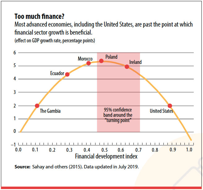
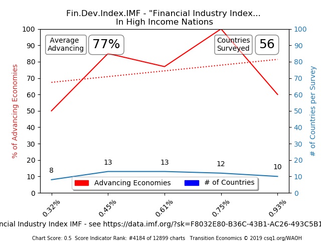
- Sweet Spots – But what about TEPs with Sweet Spots? A “Sweet Spot” indicator looks like the IMF Finance Industry Index. The Index shows that Finance Industries are a help to any economy up to a certain size (when valuation equals GDP, according to their reports), and then finance industries are harmful above that size.
A frequency distribution chart for this index looks like a McDonald’s golden arch. Notice how the starting and ending values both have low values. Will the rule above provide us with the 30% Advance and 70% Collapse “threshold value” that we need?


The answer is Yes. For Sweet Spot indicators, our process works just the same. Remember that we are looking for the 70/30 threshold “line” within the data. Nations with values above this threshold – are Advancing, while nations below this threshold are Collapsing – for the purposes of this exercise.
- With this threshold value of 23.8 in hand, we are now going to assume that: Savings >= 23.8 (greater than or equal to) are Advancing, and nations with Savings < 23.8% (less than) are trending toward collapse – based on Domestic Savings.
That’s it, you’re done. By the Science of 70%, you have just created a new way to confirm the causality of any measured national indicator.
Many types of TEP Reports
In the next example, we see a TEP (Transition Economics Proof) frequency distribution chart created using the measured indicator Trade Balance (as a % of GDP). Trade Balance data can be downloaded here.
-
To determine is each country advancing or collapsing by Trade Balance, we use a threshold value of 0% so that any nations with trade balances above 0% are Advancing; and, below 0% a nation is collapsing (according to the Trade Balance indicator). That gives us a list of nations that are advancing or collapsing, and we show exactly how we use these lists below in the “Important Parts of a TEP Chart” section.


In the example TEP Chart above, 1oo% of the 15 nations surveyed with high Gross Domestic Savings (GDS) statistics are advancing nations (according to their Trade Balance threshold values), while 100% of nations with low GDS scores are collapsing. The blue line on the TEP chart indicates how many nations participated in each survey to assess the collapse/advance ratio.
- If 10 nations are surveyed and 5 nations are advancing in this group, then the y-axis score would be one-half, 5/10 1/2 , .5 , or 50%
Initially, Transition Economics relied on a handful of highest-scoring Causal indicators and aggregate indicators (like SCP and Social Contract).
In 2022, “Threshold Analytics” (TA) was added to permit the analysis of hundreds of highest-scoring indicator thresholds for more detailed comparisons. Consider this TA report comparing the most influential, top-scoring measures between two countries – 1. Canada: a marginally collapsing nation, and 2. Netherlands: an advancing nation and one of the highest productivity countries in the world consistently over the past 60 years.

Notice on TEP Sheets, that the TEP Charts which use Advance/Collapse measures other than Trade Balance, state the threshold used …

This TA chart is created by MEMS AI and it permits the comparison of many high-performing countries as is shown here for just two nations.

TEP Sheets stack different types of TEP Reports for advance or collapse comparisons using Social Contract (SCP), Social Contract Product, GINI, Change in measured values over 10 and 20-years, per Capita, and other measured comparison (see https://csq1.org/info/NY.GDS.TOTL.ZS.htm to see a full TEP sheet at WAOH).
Why does this approach work?
This works because a TEP Chart, Sheet, Score, or Ranking shows which indicators have strong causality and which indicators do not.
Pop Quiz #1: Which of the next four indicators, shows higher Causality?


Learning:
- When a nation invests to increase its Social Contract and Gross Domestic Savings per Capita, it will improve its economy reliably by that investment
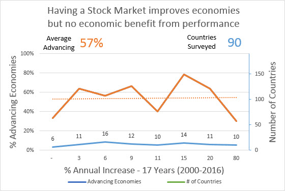
- When a nation invests to increase its GDP or Stock Market Performance, the investment will not improve economy
TEP frequency distribution charts showing little causality (low scores/amplitudes in their TEP Charts) will comprise the lion’s share of reports and only those reports with truly high causality will dominate to top Rankings.
Pop Quiz #2
Can you call GDP a Causal Indicator? Here is the TEP Chart for GDP …
GDP is a 2000th rank report with a chart score of .67. Using this report would be like doing dental work with a bag of hammers, and would yield meaningless results in TEP frequency distribution analyses.
No, GDP is not a Causal Indicator because it’s not a meaningful measure of economy. Focusing on GDP will seldom ensure economic advance.
This report’s value to politicians is that it is always positive (it contains inflation and their sponsor’s “profit”). If they can convince untrained voters that an always-positive report means that they are doing a good job, they can get themselves re-elected.
GDP hides big problems in an economy, as seen in this 100-year GDP report that hides two “Great Depressions” completely …
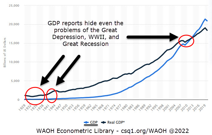
Other reasons that GDP is a less meaningful report include:
- Inflation is counted as Economic Production,
- Bubbles are counted as Production,
- Sales economies (business profit) and lost family pensions (business profit) are counted as Production – when none of this is Economic Production at all really
I’m glad to see you caught that trick question, let’s continue.
Tuning Thresholds
If you find too many high-scoring 1.0 TEP reports (there should only be a few dozen from 1600 indicators at maximum), you have set your threshold too low – so try the value located at the 75% datapoint of the survey data.
Alternatively, if you find that too few TEP Reports have an amplitude score of 1.0, then lower your threshold datapoint to create more 1.0 scoring TEPs. You should only be thresholding causal indicators so that the comparisons of all reports are as valid as possible.

Evidence-based Economics is a Computer Science, that deprecates theory-based curricula – Make it Viral!
200 nations are measuring this indicator; so there are 200 comparisons to a threshold value (of 70%) in each TEP Chart, 20 to hundreds of TEP Charts per indicator (TEP Sheet), and 1600+ measures/indicators. So, you can begin to see the value of automating all of this simple but repetitive addition, subtraction, multiplication, and division work. Now consider the number of computations required to build a chart of the “trend change” in TEP scores or ranks over time for 60 or 100 years – for every TEP and indicator as well; that’s a lot of number-crunching – that a computer can accomplish in just seconds.
This is the reason that we say evidence-based economics is a computer science, and why Transition Economics discourages mathematic guesswork and obfuscation. As Isaac Newton put it, science should be simple.
The value at the 62% data point ($0.00 or 0.0% GDP) works well as a threshold for some datasets like Trade Balance, based on my experience.
So our Science of 70% is more a Science of around 70% really.
The actual scores matter less than the Rankings but to get rankings that are consistently causal between different indicators, you will want to be consistent with the number of reports that compute to a score of 1.0 – across all of any one indicator’s Frequency Distribution charts. Admittedly, this last point is a nuanced nice-to-have, but it also shows experience in working with the Science of 70% datasets.
How good is our automation at present?
When we say that evidence-based economics is a computer science, we aren’t kidding – but we also always want to give researchers the tools to validate any automated number crunching for yourself on a spreadsheet too.
Software tools like WAOH and MEMS take around 4 hours to recreate 1600 TEP sheets with scoring and ranking data (assuming that all data is current in our cache). If you are old enough to remember Windows 2.0, it was groundbreaking and MEMS is further along than that – probably at a Windows 5.0 level at this point.
Getting Transition Economics and its tools to higher levels of maturity is just a function of time, funding, development, and Adoption.
So, do your part and get the word out there, that evidence-based civic science is essential for human advance’s reliable future. We need to be teaching and building tools that can double economies reliably as a national priority.
Important Parts of a TEP Chart
The Red Line: 28 is the minimum number of countries needed to create a TEP Chart Frequency Distribution Chart, and we try to provide a minimum of four surveys (X-axis ticks) on a TEP chart as well. Each point on the Red Line measures how many surveyed nations in this data range, were advancing versus collapsing (according to the causal measure).
The Blue Line: a blue line is added to every TEP Chart to explain how many countries participated in each survey at the indicated x-axis value. A minimum survey size of seven countries is considered minimum for a meaningful survey. If you see only 3 or 4 nations were surveyed, we can’t put much stock in the result; so, a higher number of surveyed countries is better than a low number.
The Dashed Red Line: is a Linear Regression line that averages the ups and downs of the survey line to provide an approximate trend. It’s a guide only.
An Orange Line: is used in manual (or spreadsheet-based) TEP Charts, while a Red line is portrayed on automated (by Python, API, or similar) charts.
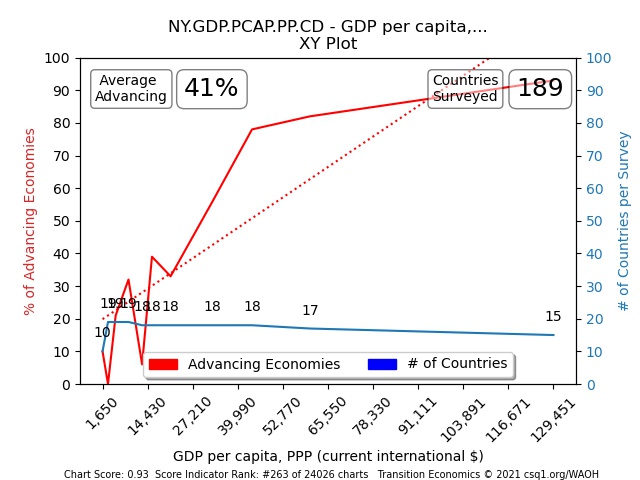
Average Advancing – this is the percentage of nations in the survey that are advancing. 32% to 42% is typical for large surveys of many countries because thresholds for advance are set between 60 and 70%; in reports of subsets of the indicator such as “high-income nations only”, the Average Advancing will be higher simply because high-income nations tend to have “advancing scores” more often than do low-income nations. In the TEP Chart survey of 189 countries below, the average percent of Advancing Nations (vs Collapsing Nations in this survey) was 41%.
Note that the threshold used for the Trade Balance indicator is set at 62% (and not a typical 70%), a decision that preferred to use a $0 Trade Balance threshold value for simplicity.
Countries Surveyed – the number of countries that were measured by the survey.
Title – explains the indicator, any abbreviations, and any filtering for high-income nations only, change over time, and similar
X-axis values – there are 25 to 30,000 indicator charts measured today at WAOH. Our computer programming usually guesses correctly, but it may guess wrong when portraying a “%” as a “$” or a “number”. Also, when data varies widely from $1 to $100,000,000,000 it can also lump a few “ticks” as $0 billion. Humanizing chart data is an evolving thing that improves with time and funding.
![]()
The TEP Chart’s Causality Measure – in this example “Advancing Economies”, determines if a surveyed country is advancing (measuring above a threshold) or collapsing (measuring below a threshold). All causality and threshold values are listed in the TEP footer and “Advancing Economies” explains that Trade Balance was used with a threshold of 0$.
This practice and convention might seem confusing or unnecessary to a Transition Economics proficient, but it affords new users easy clarity on what the Red Line hopes to measure.
Chart Score – is the amplitude of the frequency distribution chart. A perfectly causal report will have a Chart Score of 1; with a maximum value of 100% – and a minimum value of 0% measured on the y-axis. The great majority of charts have a score of less than 1
Indicator Rank – is where this score puts this report in comparison with all other reports
XY Scatter Plot Charts
A TEP chart is an XY Scatter Plot Chart with an equalized horizontal axis (X-axis). Arguably an XY Chart is the more accurate, but when only 200 countries keep all stats and not every nation participates in keeping every statistic, we need to maximize the benefit of the available data. WAOH and MEMS’s TEP Sheets display both TEP and XY Charts for the same indicators for this reason.
The following two charts plot the same data with a TEP on the left and XY Scatter Plot on the right. As TE report scoring is based on amplitude (y-axis) only, x-values don’t affect scores or report rankings.

The Domestic Savings example TEP Chart
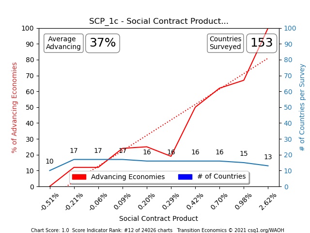
I chose a Causal indicator (Domestic Savings) for the example in Step 1 above. Causal indicators have high-scoring TEP frequency distributions (note that its Score is 1.0 in the chart below – the highest score possible).
Causal reports show us that nations with high values advance 100%, and nations with poor values collapse 100%.
As an aside, the Domestic Savings indicator was identified as a causal indicator using another high-scoring indicator, Trade Balance.
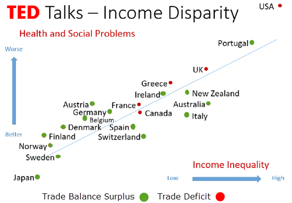
How did I know that Trade Balance was an important measure? I observed that it was a factor in other evidence-based reports … Notice in these two charts how Income Equality reduced Health and Social Problems in nations with positive trade balances, where trade deficit nations were highest in Health and Social Problems.

By using Trade Balance <> greater or less than zero (0) – “Advancing” was assigned to all nations with trade balances greater-than zero, and “Collapsing” was assigned to nations with negative trade balances (less-than zero). We decided that Germany and Japan are “Advancing”, but that Canada and the U.S. are “Collapse Trending”.
Transition Economics calls the Trade Balance TEP-Chart’s red line “Advancing Economies”, but any Causal indicator would let you build new criteria to determine Advance or Collapse.
Now we have a table of chart-able values for 187 countries.
In line 1 of the table below, we see that Canada is a collapse-trending “collapsing” nation with a Gross Domestic Savings value of 21.5% of its GDP. This assessment of advance or collapse for every nation, permits us to see how many nations in any survey, were advancing and which were collapsing.
| Nation |
Status (C or A) |
Gross Domestic Savings (as a %GDP) |
| Canada | Collapsing (C) | 21.5 |
| Germany | Advancing (A) | 27.2 |
| Japan | Advancing (A) | 24.5 |
| For 187 countries | … | … |

This frequency distribution TEP Chart above, now shows at left that 29 (10 + 19) nations with Savings less than -13% and 3%, were 100% collapsing; while 15 nations at the farthest right-hand side of the chart – had Savings greater than 43% and up to 79%, and 100% of those nations were Advancing (A Status). Based on this TEP chart, Domestic Savings certainly looks like it might be a causal indicator.
What does this data tells us?
Note from the TEP Chart’s frequency distribution of 187 nations, that 100% of high-Domestic Savings nations are advancing and 100% of low-savings nations are collapsing. The amplitude of this chart is 100% (1.0) from bottom to top; so, we can calculate a score by taking its maximum value of 100% (1.0) minus the chart’s minimum value of 0.0 – for a total score of 1.0. This is the highest amplitude possible in a TEP Chart; and, if we did a good job with our (70%) advance/collapse threshold, there shouldn’t be too many of these.
This would rank Domestic Savings with other 1.0 scoring TEP charts by Trade Balance (“Advancing Economies” in the legend indicates that Trade Balance was used), while the great majority of measures for other economic and social indicators, will score much lower than 1.0.
How to determine the Truth about this report’s causality
This TEP Chart report is now either telling us that Savings is a causal indicator, or that high-savings nations simply export more than import as a coincidence.
Here is where science, correlating reports, experience, and observation come into play.
- Look at the top scoring 20 nations now, and also the bottom-scoring nations.
Is the standard of living and production in Germany higher than counterparts in Japan, Canada, and the U.S. by observation? Perhaps a comparison between highest savings nations (Ireland, Qatar, Brunei, Luxemburg, and UAE) versus lowest-saving nations (Somalia, Haiti, West Bank and Gaza, Zimbabwe, Central African Republic) confirms causality.
2. Look for confirmation (on the TEP Sheet) from TEP Charts created using other causal measures of collapse and advance
b) Other Reports and research sources:
Trade Surplus nations have higher Social Contracts (lower social problems and inequity) similarly – shown here by a report created by an Edinburgh University Research Team in 2013. Individuals and nations with more savings and fewer social problems have the potential to be more productive, and almost all of the countries on the lower half of this list have trade surpluses consistently.
On the TEP Sheet for Domestic Savings, we can see how Domestic Savings (%GDP) look based on a frequency distribution TEP Chart of SCP values >5.0 (5.0 is a value determined by the Science of 70%). The TEP Chart’s amplitude is .7 (70% minus 0) so it’s not as high as the amplitude above, therefore its lower-ranking TEP Chart but still holds valuable information.
3. Are there other factors?
a) Measures in $US are going to place high cost of living nations higher simply because cost of living is more expensive – always use PPP adjusted and %GDP measures to mitigate this problem
b) Sanity checks – Fertility is a TEP report that shows that lower fertility rate nations are advancing more often than high-fertility nations. It would be a mistake (misleading) to assume Fertility below sustainable levels is desirable, as, in fact, a Crime Against Humanity is created when anti-family policies are used to win democratic elections.

Low Fertility Rates Unsustainable at less than 2.2
Reading TEP Charts
A tutorial for reading TEP Charts is located under the Data Science tab at the WAOH library and also on the Transition Economics info webpage.
I use CSQ Research’s MEMS data science tools to find the highest-ranking TEP Charts, and the WAOH Library Data Science page also posts these as searchable sheet scores at https://csq1.org/waoh-data-science .
Exercise 2: Building a “National Savings” TEP Charts
- To build this TEP Chart yourself, you can start with a basic excel template or upload a much larger sample pack on the About WAOH page – under Contributions (or click here). There are a lot of examples in the larger large pack and you can create your own frequency distribution charts easily here as well.
- Here in the spreadsheet is a TEP chart that I created using the process described above

- Learn to use your new Threshold definition. As you work with the TEP charts created by the data, we might decide to tweak the threshold value to use 65% or 75%. This chart had a too-low “Average Advancing” of 24% so I reduced the Domestic Savings value to 25 (from 27.5) and this improved Average Advancing to 32%.
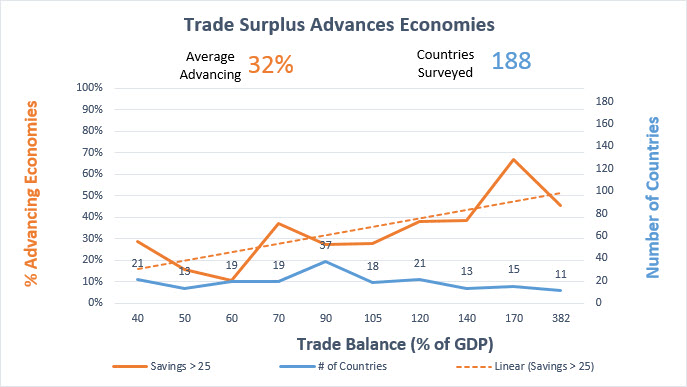
38% Average Advancing is a good target, so I could have lowered the threshold again and this would have lifted the score of this and all 1600 other indicator reports. Again, as long as only a dozen or two-dozen TEP Report per 1600 indicators are showing scores of 1.0, your threshold value for advance is valid
Our MEMS tool analyzes 1600 indicators and does all of this heavy number-crunching and chart work over approximately four hours, with present configuration assumptions.
As you can see, this can be a time-consuming one-chart-at-a-time analysis, but the Science of 70% works well to find causality within a very large dataset using this testing method.
By measuring the amplitudes of TEP Charts created by National Savings, we can easily rank the top correlations to the lowest rank using this causal indicator now as well.